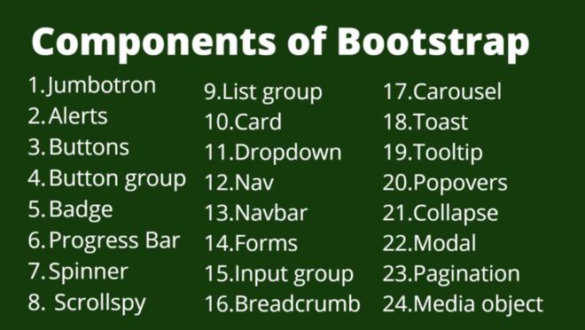
Bootstrap is a powerful toolkit for building responsive, mobile-first websites. Among its many features, the pre-styled components stand out for their ease of use and versatility. Here’s a look at the top 10 Bootstrap components every developer should know.
1. Navigation Bar
The navbar is essential for website navigation. Bootstrap’s navbar component is responsive and customizable.
- Features: Supports brand text, links, dropdowns, and more.
- Example:
  <nav class="navbar navbar-expand-lg navbar-light bg-light">
    <a class="navbar-brand" href="#">Navbar</a>
    <button class="navbar-toggler" type="button" data-toggle="collapse" data-target="#navbarNav">
      <span class="navbar-toggler-icon"></span>
    </button>
    <div class="collapse navbar-collapse" id="navbarNav">
      <ul class="navbar-nav">
        <li class="nav-item active">
          <a class="nav-link" href="#">Home</a>
        </li>
        <li class="nav-item">
          <a class="nav-link" href="#">Features</a>
        </li>
      </ul>
    </div>
  </nav>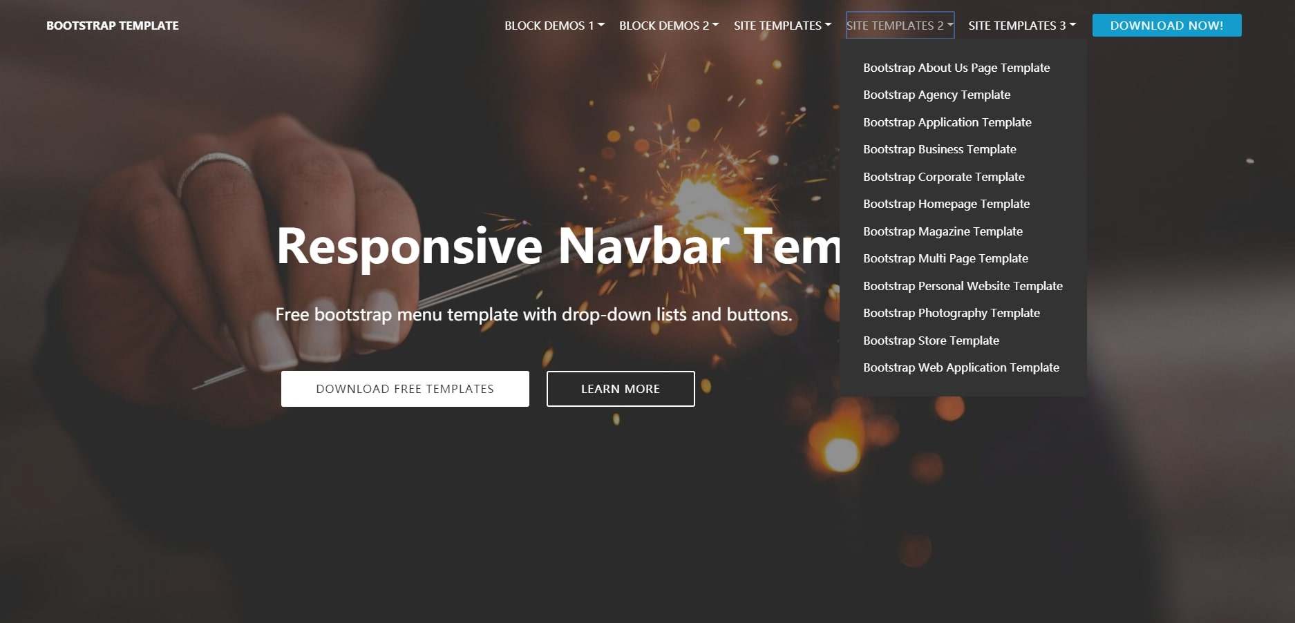
2. Buttons
Bootstrap offers a variety of button styles and sizes.
- Features: Different colors, sizes, and states.
- Example:
  <button type="button" class="btn btn-primary">Primary</button>
  <button type="button" class="btn btn-secondary">Secondary</button>
3. Forms
Creating forms is simple with Bootstrap’s pre-styled form elements.
- Features: Supports inputs, checkboxes, radios, and more.
- Example:
  <form>
    <div class="form-group">
      <label for="email">Email address</label>
      <input type="email" class="form-control" id="email">
    </div>
    <div class="form-group">
      <label for="password">Password</label>
      <input type="password" class="form-control" id="password">
    </div>
    <button type="submit" class="btn btn-primary">Submit</button>
  </form>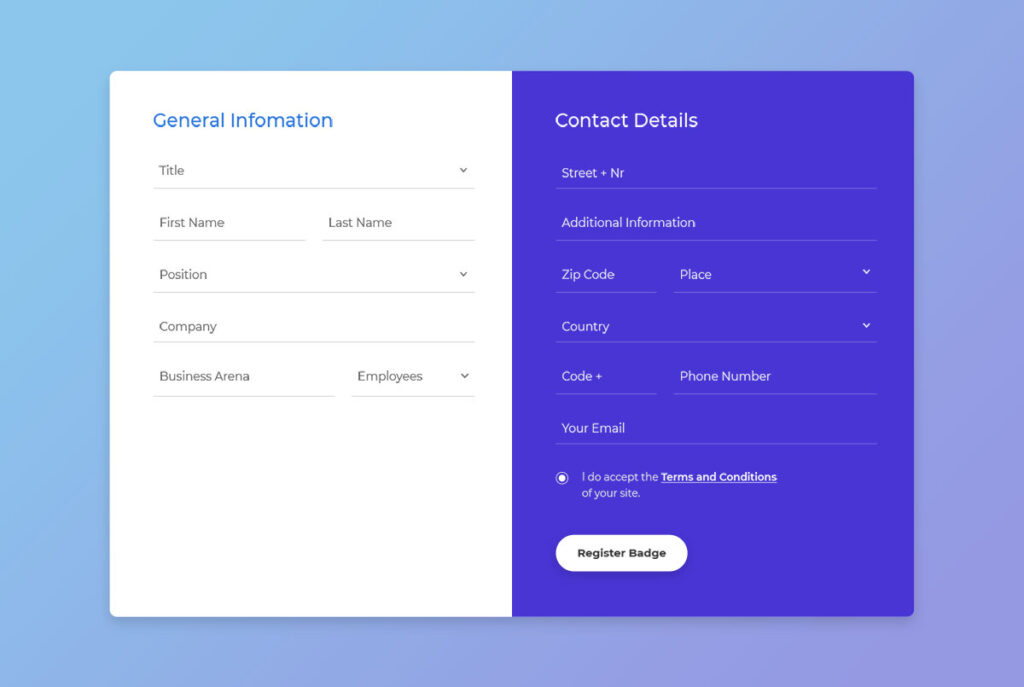
4. Cards
Cards are flexible and extensible content containers.
- Features: Can include images, text, lists, and links.
- Example:
  <div class="card" style="width: 18rem;">
    <img class="card-img-top" src="..." alt="Card image cap">
    <div class="card-body">
      <h5 class="card-title">Card title</h5>
      <p class="card-text">Some quick example text to build on the card title.</p>
      <a href="#" class="btn btn-primary">Go somewhere</a>
    </div>
  </div>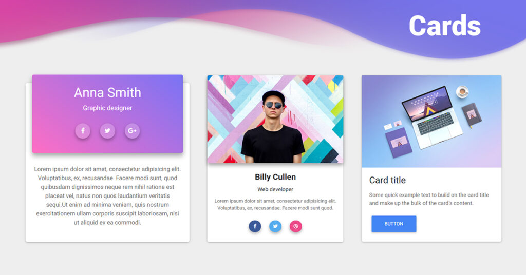
5. Modals
Modals are used to create dialog boxes or popups.
- Features: Supports headers, footers, and body content.
- Example:
<button type="button" class="btn btn-primary" data-toggle="modal" data-target="#exampleModal">
Launch demo modal
</button>
<div class="modal fade" id="exampleModal" tabindex="-1" role="dialog">
<div class="modal-dialog" role="document">
<div class="modal-content">
<div class="modal-header">
<h5 class="modal-title">Modal title</h5>
<button type="button" class="close" data-dismiss="modal">
<span>×</span>
</button>
</div>
<div class="modal-body">
...
</div>
<div class="modal-footer">
<button type="button" class="btn btn-secondary" data-dismiss="modal">Close</button>
<button type="button" class="btn btn-primary">Save changes</button>
</div>
</div>
</div>
</div>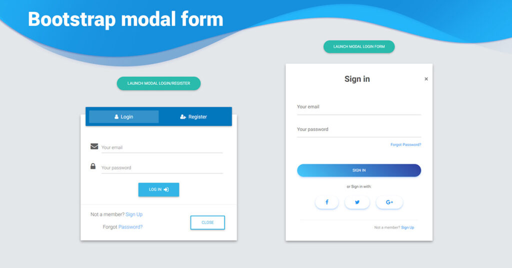
6. Alerts
Alerts are used to provide feedback messages.
- Features: Different styles for success, danger, warning, and info alerts.
- Example:
  <div class="alert alert-success" role="alert">
    A simple success alert—check it out!
  </div>
  <div class="alert alert-danger" role="alert">
    A simple danger alert—check it out!
  </div>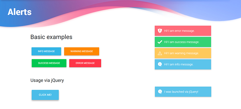
7. Carousel
Carousels are great for creating slideshows.
- Features: Supports images, text, and controls.
- Example:
  <div id="carouselExampleIndicators" class="carousel slide" data-ride="carousel">
    <ol class="carousel-indicators">
      <li data-target="#carouselExampleIndicators" data-slide-to="0" class="active"></li>
      <li data-target="#carouselExampleIndicators" data-slide-to="1"></li>
    </ol>
    <div class="carousel-inner">
      <div class="carousel-item active">
        <img class="d-block w-100" src="..." alt="First slide">
      </div>
      <div class="carousel-item">
        <img class="d-block w-100" src="..." alt="Second slide">
      </div>
    </div>
    <a class="carousel-control-prev" href="#carouselExampleIndicators" role="button" data-slide="prev">
      <span class="carousel-control-prev-icon" aria-hidden="true"></span>
      <span class="sr-only">Previous</span>
    </a>
    <a class="carousel-control-next" href="#carouselExampleIndicators" role="button" data-slide="next">
      <span class="carousel-control-next-icon" aria-hidden="true"></span>
      <span class="sr-only">Next</span>
    </a>
  </div>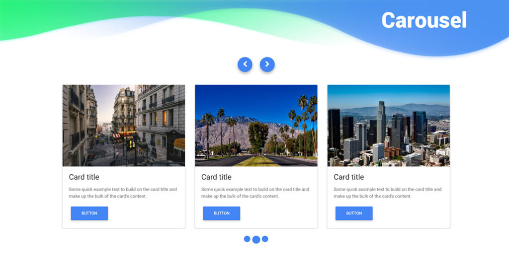
8. Jumbotron
Jumbotrons are used for showcasing key content.
- Features: Creates a large, attention-grabbing section.
- Example:
  <div class="jumbotron">
    <h1 class="display-4">Hello, world!</h1>
    <p class="lead">This is a simple hero unit, a simple jumbotron-style component for calling extra attention to featured content or information.</p>
    <a class="btn btn-primary btn-lg" href="#" role="button">Learn more</a>
  </div>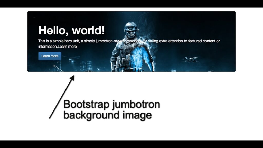
9. Tooltips
Tooltips provide contextual information on hover.
- Features: Customizable content and positioning.
- Example:
  <button type="button" class="btn btn-secondary" data-toggle="tooltip" data-placement="top" title="Tooltip on top">
    Tooltip on top
  </button>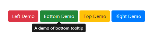
10. Pagination
Pagination components make navigation easier for multi-page content.
- Features: Supports different styles and sizes.
- Example:
  <nav aria-label="Page navigation example">
    <ul class="pagination">
      <li class="page-item"><a class="page-link" href="#">Previous</a></li>
      <li class="page-item"><a class="page-link" href="#">1</a></li>
      <li class="page-item"><a class="page-link" href="#">2</a></li>
      <li class="page-item"><a class="page-link" href="#">Next</a></li>
    </ul>
  </nav>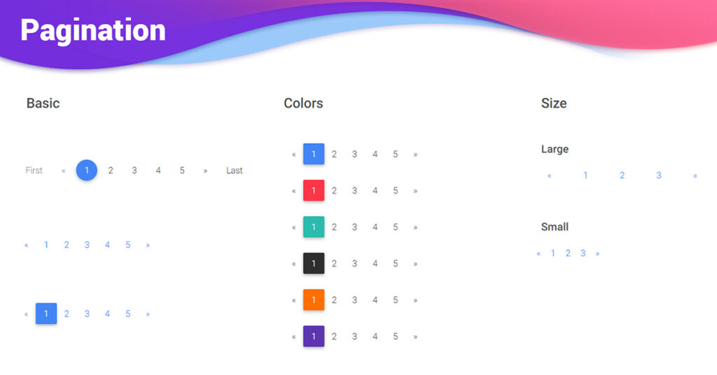
Conclusion
Mastering these top 10 Bootstrap components can significantly enhance your web development skills. Whether you’re building a simple site or a complex application, these components provide the functionality and design consistency you need.
For more information and examples, visit the official Bootstrap documentation.
FAQS